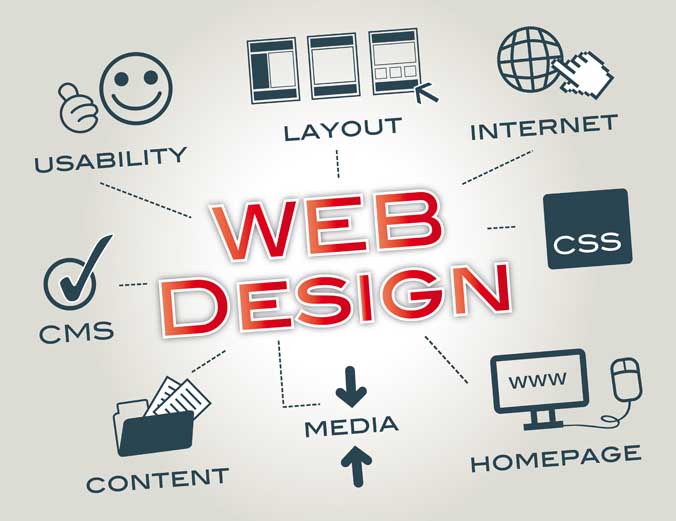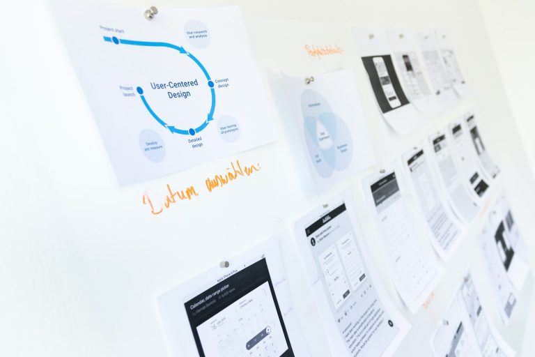
o you know what Design Usability is? Usable Design is increasingly central and relevant in marketing strategies. Here I explain what usability is and I suggest you 5 principles of Design Usability that you must necessarily note!
The ‘ Usability is the measure of how well a specific user in a specific context can use a product / design to achieve a certain goal in an effective, efficient and satisfying.
Thus the Interaction Design Foundation defines usability.
In his famous Don’t Make Me Think, Steve Krug writes that if something is usable, it means that a person with average skill and experience can understand how to use a certain tool to achieve a specific purpose without running into problems.
Or, at least, without running into too many problems.
What are people looking for today?
This is always the question you have to start with every time you design a website like Weboost 472154. People today are constantly looking for effective, easy and fast solutions.
They are not willing to invest time in things and situations that do not immediately appear convincing and decisive.
When we surf online and want to consult a guide, view a product, buy a solution, we run away from everything that forces us to think, that creates friction, that is not immediately clear to us.
Here, here comes the Design Usability, the Usability of Design, the ability to design and create browsing and shopping experiences that are clear, simple, fast, satisfying. And that they are capable of attracting people’s attention, interest and trust.
Now I suggest 5 principles of Design Usability that you must respect every time you design a website or an e-commerce.
5 principles of Design Usability
Do you want to win over people? Do you want to offer them an engaging and compelling experience? It starts from here, from these 5 principles that allow you to lead the user where you want without having to stop and think, wonder, doubt.
1. Design the navigation
The first thing you have to do when you start designing a website is to design the navigation, which must always be clear, simple and consistent with both the person’s need, the goal to be achieved and the experience itself.
Keep in mind that while browsing we often fail to understand where we are because we have no sense of proportion or direction.
This is why the design of the navigation that the user performs is a preparatory and fundamental activity for Design Usability.
Users must always have the feeling that they are in the right place at the right time.
2. Create effective visual hierarchies
The hierarchy is used to define immediately, clearly and quickly:
- What are the most important contents and elements;
- What are the related ones;
- What is part of the other;
- What does it refer to still more?
A good visual hierarchy facilitates the understanding and retrieval of the contents of interest, because it organizes them and defines an order of priority.
How to build an effective visual hierarchy? You have to consider these 3 aspects:
- The most important elements must also be more visible graphically;
- You must also visually connect the elements that are logically connected;
- You need to nest the content and elements.
3. Users like it easy: don’t compromise usability in favor of creativity
Design Usability must always reduce the amount of reasoning required to perform an action and to satisfy a need.
And it must eliminate the feeling of uncertainty that always occurs during navigation.
To do this you have to make all the choices that the user has to make easy: click on a link or on a call to action button, choose a page from the navigation menu, fill out a form, go back to the homepage.
And do you know what comes to your aid? The conventions. Designers often compromise Usability in favor of creativity but there is nothing more wrong if you look at the project from the user’s point of view.
He wants to satisfy his need and to do so he must feel at ease in the space in which he navigates. Today we are expert web surfers: we know where what is and how each element and / or content is presented.
Disrupting the conventions, we are used to can compromise – forever – the user’s browsing experience.
4. Always choose clarity, eliminate noise, suspend the superfluous
Clarity is the source of Usability. Hence simplicity, understanding, ease and immediacy. If everything on your website is clear to the user, it will go straight and send to the destination.
Here’s why good Design Usability:
- It is based on the use of grids that allow you to efficiently organize the design, contents and elements of the website;
- Omits useless elements, contents and words;
- Avoid the overcrowding of elements and contents within a page, in the awareness that everything that is not strictly useful for solving the user’s problem must disappear.
5. Organize the pages in clearly defined areas and choose the right name
Designing the areas of each page of the website allows the user to immediately recognize each specific section and immediately understand which ones he wants to focus on and which ones he can ignore.
That way he won’t waste time and won’t wonder if he’s in the right place.
The names with which you choose to identify individual pages also play a fundamental role in Design Usability. The name must:
- Being in the right place;
- be clearly visible;
- explain the content of the page and correspond to the intention of the user’s click.
Design Usability: the journey begins with the user
As with any Digital Marketing activity, Design Usability also begins with the user, who he is, what he wants, the result he wants to achieve.
When you have this in mind, you can design a website with a truly usable design.


